Before and After
Before and After
Before and After
of my porfolio website
of my porfolio website
of my porfolio website
Before
Before
Before

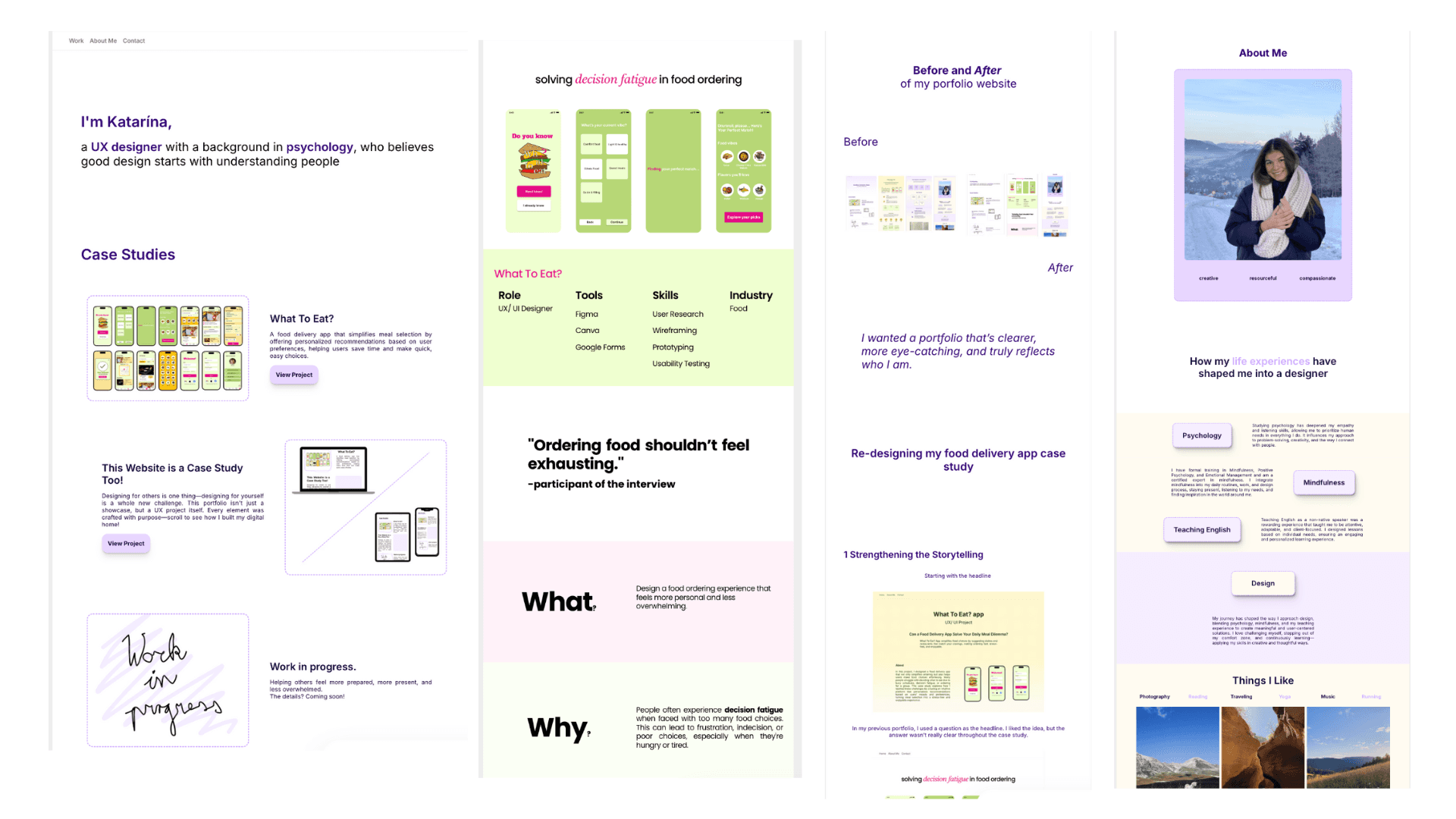
After
After
After
I wanted a portfolio that’s clearer, more eye-catching, and truly reflects who I am.
I wanted a portfolio that’s clearer, more eye-catching, and truly reflects who I am.
I wanted a portfolio that’s clearer, more eye-catching, and truly reflects who I am.
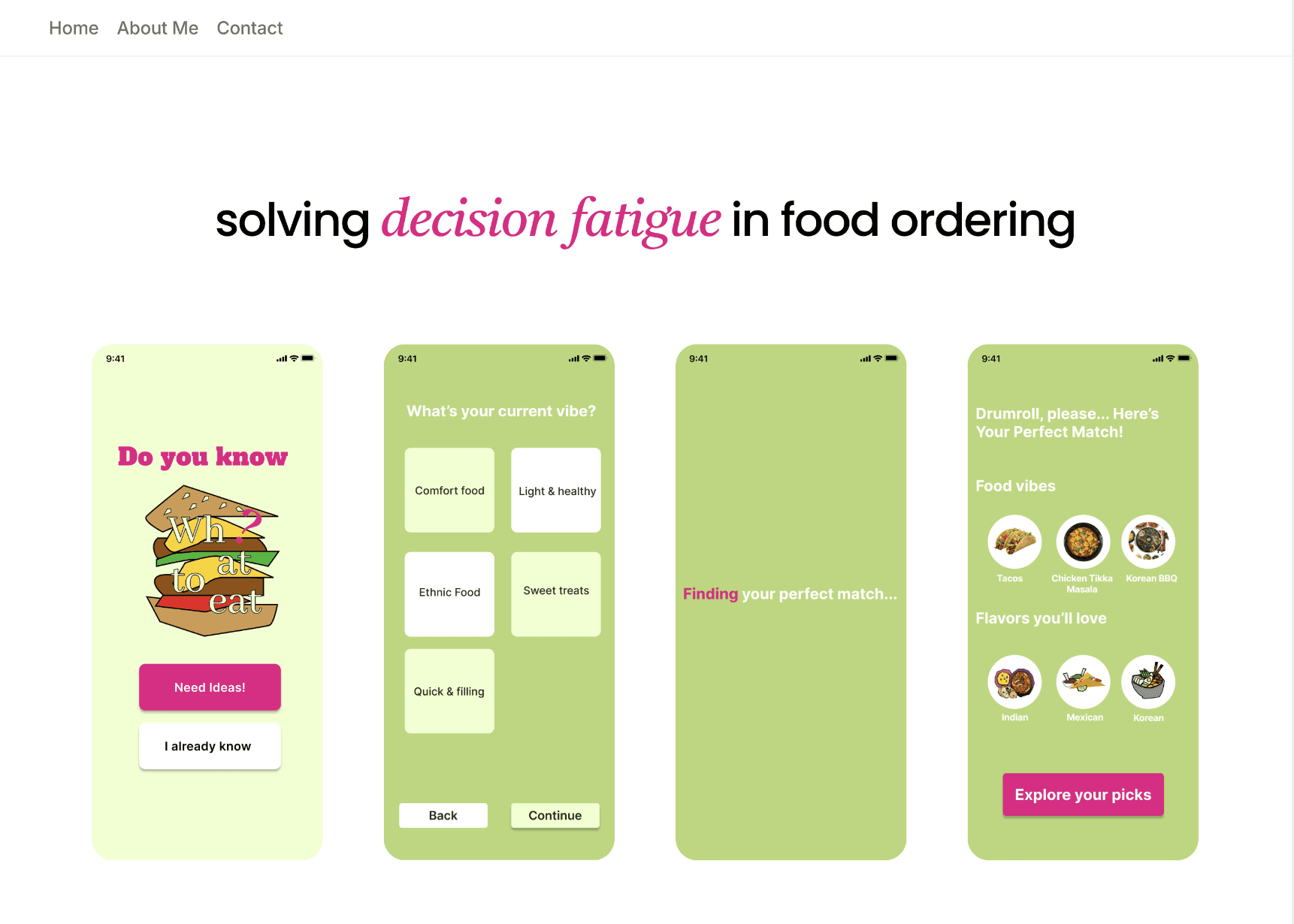
*Re-designing my food delivery app case study
*Re-designing my food delivery app case study
*Re-designing my food delivery app case study
1 Strengthening the Storytelling
1 Strengthening the Storytelling
1 Strengthening the Storytelling
Starting with the headline
Starting with the headline
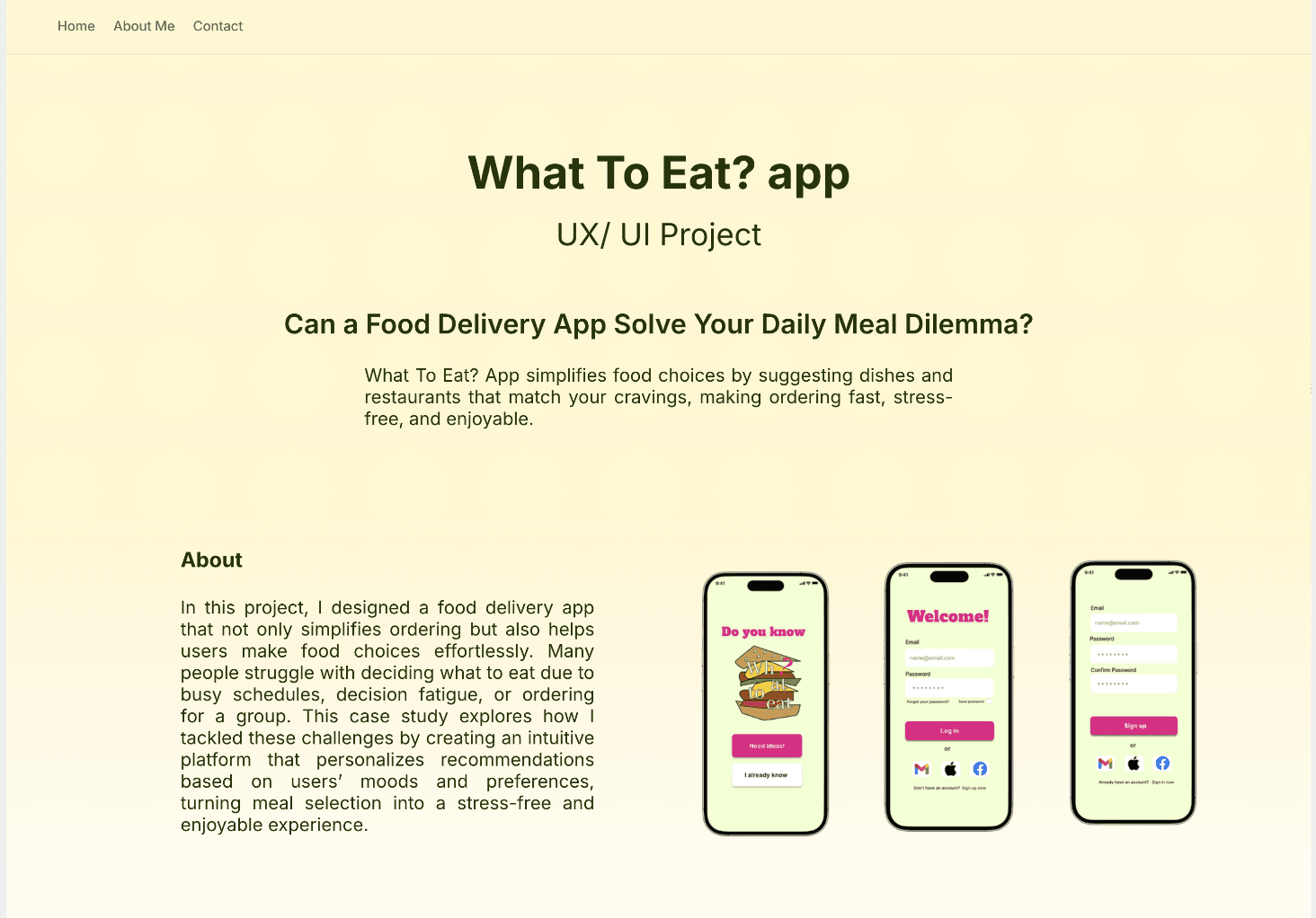
In my previous portfolio, I used a question as the headline. I liked the idea, but the answer wasn’t really clear throughout the case study.
In my previous portfolio, I used a question as the headline. I liked the idea, but the answer wasn’t really clear throughout the case study.
In my previous portfolio, I used a question as the headline. I liked the idea, but the answer wasn’t really clear throughout the case study.
For the new version, I wanted the story to be more connected. So I wrote a clearer headline that sets the direction for the whole page. It’s directly tied to the three main problems and helps guide the viewer from user needs to the final screens.
For the new version, I wanted the story to be more connected. So I wrote a clearer headline that sets the direction for the whole page. It’s directly tied to the three main problems and helps guide the viewer from user needs to the final screens.
For the new version, I wanted the story to be more connected. So I wrote a clearer headline that sets the direction for the whole page. It’s directly tied to the three main problems and helps guide the viewer from user needs to the final screens.
2 Problems and Solutions
2 Problems and Solutions
2 Problems and Solutions
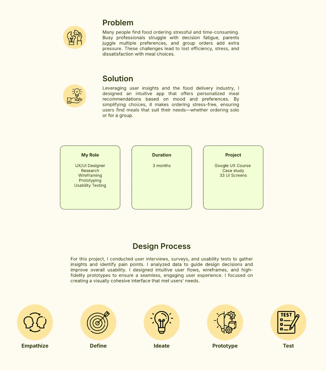
I wanted to make the connection between problems and solutions more direct and visually engaging. In my previous portfolio, the problem was only mentioned once and wasn’t clearly tied to any specific screen.
I wanted to make the connection between problems and solutions more direct and visually engaging. In my previous portfolio, the problem was only mentioned once and wasn’t clearly tied to any specific screen.
I wanted to make the connection between problems and solutions more direct and visually engaging. In my previous portfolio, the problem was only mentioned once and wasn’t clearly tied to any specific screen.
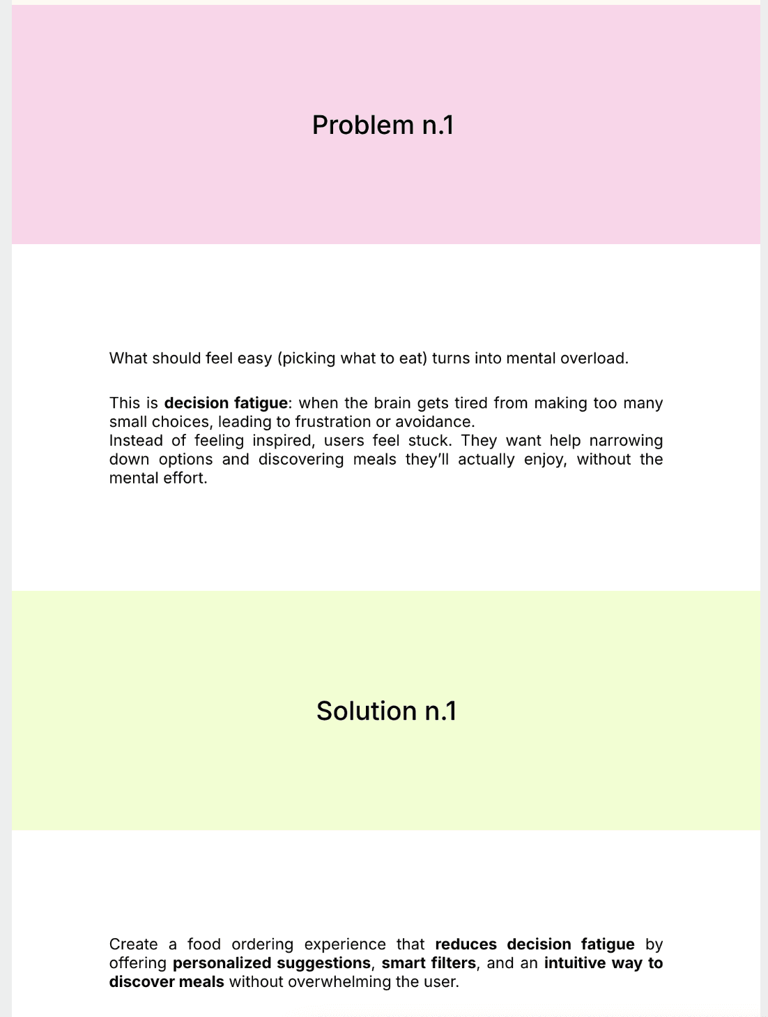
In this updated version, I’ve focused on three distinct user problems. Each one is followed by targeted design solutions which are supported by clear, relevant screenshots. These visuals help demonstrate exactly how my design solves each issue.
In this updated version, I’ve focused on three distinct user problems. Each one is followed by targeted design solutions which are supported by clear, relevant screenshots. These visuals help demonstrate exactly how my design solves each issue.
In this updated version, I’ve focused on three distinct user problems. Each one is followed by targeted design solutions which are supported by clear, relevant screenshots. These visuals help demonstrate exactly how my design solves each issue.
3 Business Impact
3 Business Impact
3 Business Impact
*new portfolio
*new portfolio
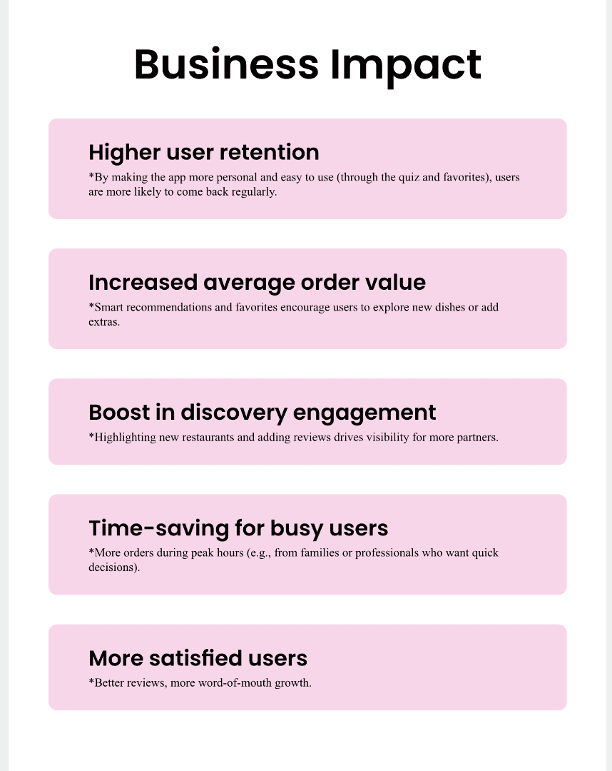
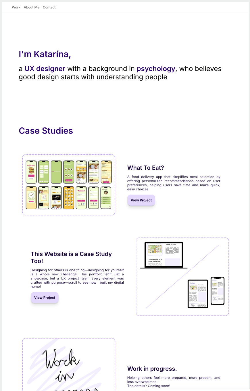
In my updated porfolio I also introduced a new Business Impact section to highlight how thoughtful design can support user needs and contribute to real results.
*this section was missing
In my updated porfolio I also introduced a new Business Impact section to highlight how thoughtful design can support user needs and contribute to real results.
*this section was missing
In my updated porfolio I also introduced a new Business Impact section to highlight how thoughtful design can support user needs and contribute to real results.
*this section was missing
4 Colors
4 Colors
In the previous portfolio, I used softer colors that made the design feel calm but a bit dull and less engaging. The story didn’t stand out as much because the visuals were too muted.
In the previous portfolio, I used softer colors that made the design feel calm but a bit dull and less engaging. The story didn’t stand out as much because the visuals were too muted.
In the previous portfolio, I used softer colors that made the design feel calm but a bit dull and less engaging. The story didn’t stand out as much because the visuals were too muted.
For the new version, I chose stronger, more vibrant colors from the app itself. This makes the case study feel more lively and helps guide the viewer through the story more clearly and energetically.
For the new version, I chose stronger, more vibrant colors from the app itself. This makes the case study feel more lively and helps guide the viewer through the story more clearly and energetically.

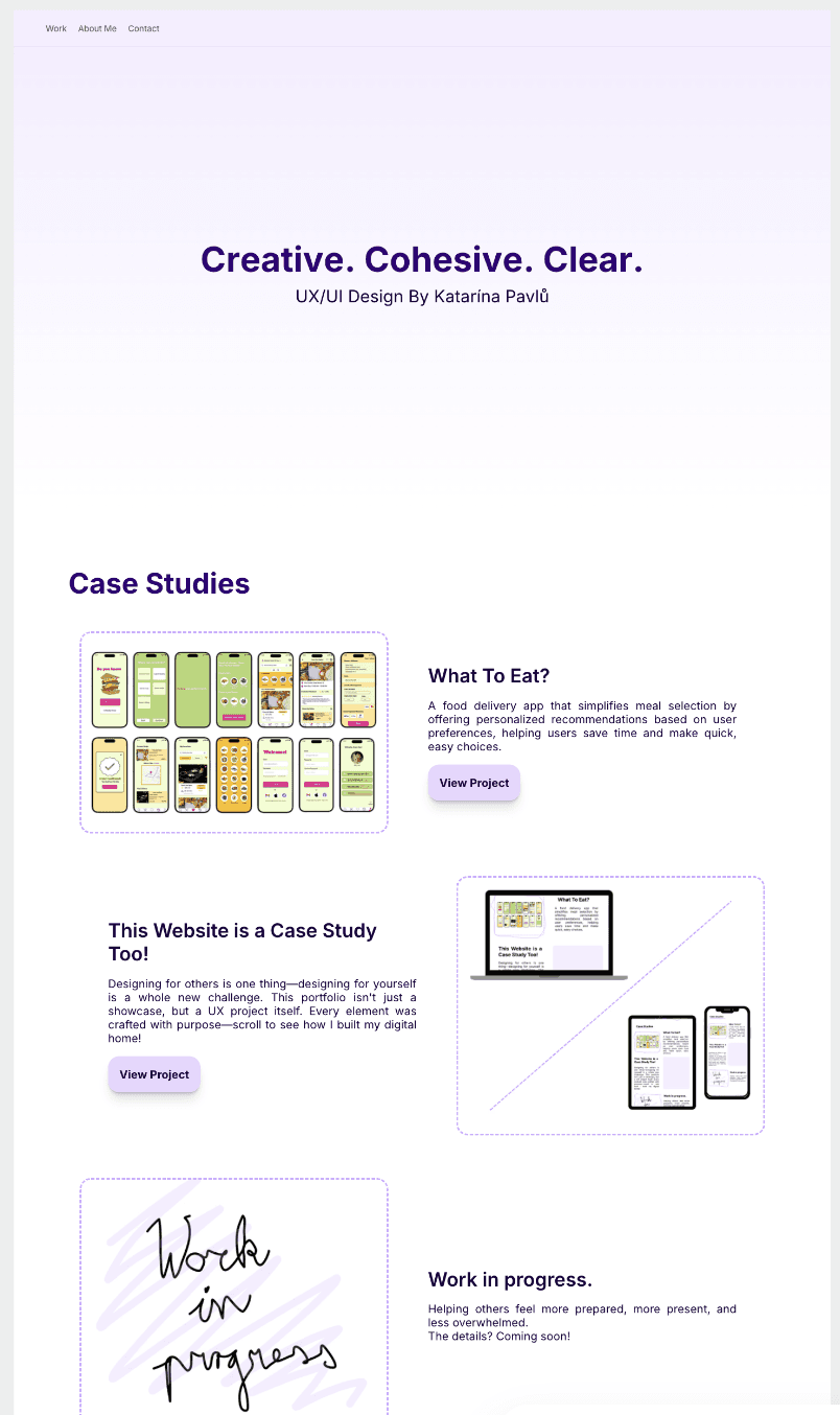
In this redesign, I made the story clearer by directly connecting problems to solutions and used bold colors to bring the case study to life. I included quotes from user research and added playful doodles to make it more fun and engaging. The goal was to create a smooth, enjoyable experience from start to finish.
In this redesign, I made the story clearer by directly connecting problems to solutions and used bold colors to bring the case study to life. I included quotes from user research and added playful doodles to make it more fun and engaging. The goal was to create a smooth, enjoyable experience from start to finish.
In this redesign, I made the story clearer by directly connecting problems to solutions and used bold colors to bring the case study to life. I included quotes from user research and added playful doodles to make it more fun and engaging. The goal was to create a smooth, enjoyable experience from start to finish.
*Redesigning this current page
*Redesigning this current page
*Redesigning this current page
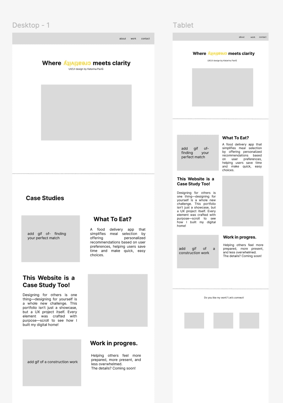
This page was the most impacted by my redesign because I shifted the focus from being a full case study of the entire website to a comparison case study of a few key pages.
This page was the most impacted by my redesign because I shifted the focus from being a full case study of the entire website to a comparison case study of a few key pages.
This page was the most impacted by my redesign because I shifted the focus from being a full case study of the entire website to a comparison case study of a few key pages.
Let's have a look at what has changed
Let's have a look at what has changed
Let's have a look at what has changed

*this current page before. no sign of comparison yet.
*this current page before. no sign of comparison yet.
I really like showing the behind-the-scenes of the original website, so I decided to keep that here too. It’s interesting to compare the old version with the new one and see how the design evolved.
I really like showing the behind-the-scenes of the original website, so I decided to keep that here too. It’s interesting to compare the old version with the new one and see how the design evolved.
I really like showing the behind-the-scenes of the original website, so I decided to keep that here too. It’s interesting to compare the old version with the new one and see how the design evolved.
How it all started
How it all started
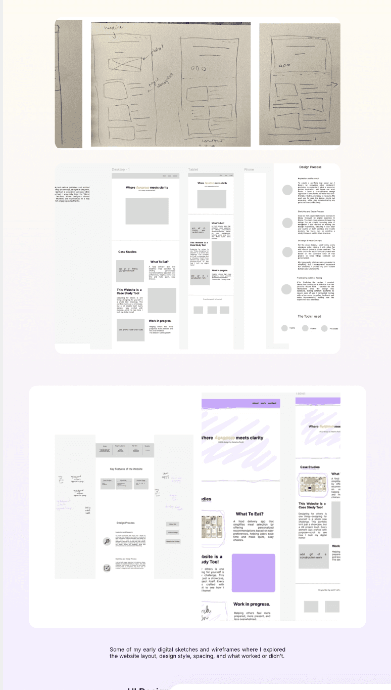
These were my first sketches of the Homepage
These were my first sketches of the Homepage
These were my first sketches of the Homepage
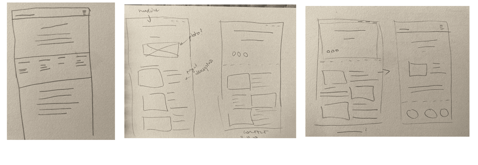
I started by working on the layout and made some changes along the way.
I started by working on the layout and made some changes along the way.
I started by working on the layout and made some changes along the way.
The second picture shows the original website I’m redesigning.
The second picture shows the original website I’m redesigning.
The second picture shows the original website I’m redesigning.
The last one is the current update. I decided to simplify things and keep it clean to make it feel more polished.
The last one is the current update. I decided to simplify things and keep it clean to make it feel more polished.
The last one is the current update. I decided to simplify things and keep it clean to make it feel more polished.
Challenges I faced
Challenges I faced
Challenges I faced
Redesigning something I already made was tougher than I expected. I had to rethink my own choices and be honest about what wasn’t working .
Redesigning something I already made was tougher than I expected. I had to rethink my own choices and be honest about what wasn’t working .
Redesigning something I already made was tougher than I expected. I had to rethink my own choices and be honest about what wasn’t working .
One of the biggest challenges was…
figuring out how to show the story clearly without adding too much. I also reached out to other professionals to get feedback, which helped a lot but sometimes brought conflicting opinions. In the end, I had to find a balance between different points of view and what felt right for the project.
What I did…
I reached out to other professionals to get feedback, which helped a lot but sometimes brought conflicting opinions.
What I did…
I reached out to other professionals to get feedback, which helped a lot but sometimes brought conflicting opinions.
What I did…
I reached out to other professionals to get feedback, which helped a lot but sometimes brought conflicting opinions.
What I learned
What I learned
What I learned
Storytelling matters
A good design doesn’t speak for itself unless you guide people through it.
Storytelling matters
A good design doesn’t speak for itself unless you guide people through it.
Storytelling matters
A good design doesn’t speak for itself unless you guide people through it.
Stronger visuals, clearer message
Refining layout and color use brought focus and made the content easier to navigate.
Stronger visuals, clearer message
Refining layout and color use brought focus and made the content easier to navigate.
Stronger visuals, clearer message
Refining layout and color use brought focus and made the content easier to navigate.
Embracing feedback
I realized how important feedback is in the design process. Redesigning is not a failure or a shame, it’s a vital step. Being open to others’ opinions and willing to make changes helps create better, more user-focused designs.
Embracing feedback
I realized how important feedback is in the design process. Redesigning is not a failure or a shame, it’s a vital step. Being open to others’ opinions and willing to make changes helps create better, more user-focused designs.
Embracing feedback
I realized how important feedback is in the design process. Redesigning is not a failure or a shame, it’s a vital step. Being open to others’ opinions and willing to make changes helps create better, more user-focused designs.
Do you like my work? Let’s connect!
Do you like my work? Let’s connect!
Do you like my work? Let’s connect!