What To Eat? app

UX/ UI Project

Can a Food Delivery App Solve Your Daily Meal Dilemma?

What To Eat? App simplifies food choices by suggesting dishes and restaurants that match your cravings, making ordering fast, stress-free, and enjoyable.

About

In this project, I designed a food delivery app that not only simplifies ordering but also helps users make food choices effortlessly. Many people struggle with deciding what to eat due to busy schedules, decision fatigue, or ordering for a group. This case study explores how I tackled these challenges by creating an intuitive platform that personalizes recommendations based on users’ moods and preferences, turning meal selection into a stress-free and enjoyable experience.

Problem

Many people find food ordering stressful and time-consuming. Busy professionals struggle with decision fatigue, parents juggle multiple preferences, and group orders add extra pressure. These challenges lead to lost efficiency, stress, and dissatisfaction with meal choices.

Solution

Leveraging user insights and the food delivery industry, I designed an intuitive app that offers personalized meal recommendations based on mood and preferences. By simplifying choices, it makes ordering stress-free, ensuring users find meals that suit their needs—whether ordering solo or for a group.

My Role

My Role

My Role

UX/UI Designer
Research
Wireframing
Prototyping
Usability Testing

UX/UI Designer
Research
Wireframing
Prototyping
Usability Testing

UX/UI Designer
Research
Wireframing
Prototyping
Usability Testing

Duration

Duration

Duration

3 months

3 months

3 months

Project

Project

Project

Google UX Course
Case study
33 UI Screens

Google UX Course
Case study
33 UI Screens

Google UX Course
Case study
33 UI Screens

Design Process

For this project, I conducted user interviews, surveys, and usability tests to gather insights and identify pain points. I analyzed data to guide design decisions and improve overall usability. I designed intuitive user flows, wireframes, and high-fidelity prototypes to ensure a seamless, engaging user experience. I focused on creating a visually cohesive interface that met users' needs.
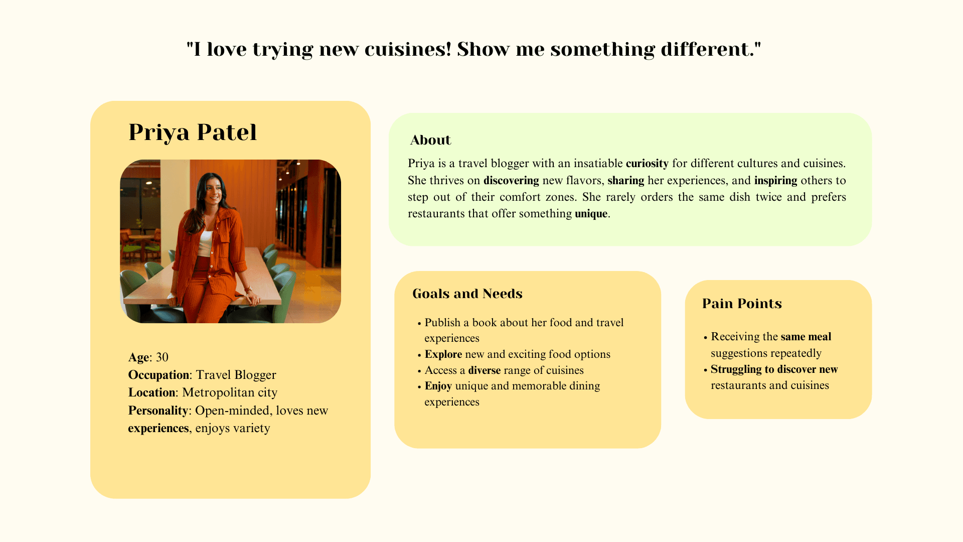
Empathize

Empathize

Empathize

Define

Define

Define

Ideate

Ideate

Ideate

Prototype

Prototype

Prototype

Test

Test

Test

Empathize

Define

Ideate

Prototype

Test

Pain Points

Pain Points

Decision-making struggle

Decision-making struggle

Decision-making struggle

Users have difficulty making a choice because there are too many options, which creates frustration and decision fatigue.

Users have difficulty making a choice because there are too many options, which creates frustration and decision fatigue.

Users have difficulty making a choice because there are too many options, which creates frustration and decision fatigue.

Reordering challenges

Reordering challenges

Reordering challenges

Users want a quick way to access meals they’ve enjoyed before, saving them time from having to search for it again.

Users want a quick way to access meals they’ve enjoyed before, saving them time from having to search for it again.

Users want a quick way to access meals they’ve enjoyed before, saving them time from having to search for it again.

Slow ordering process

Slow ordering process

Slow ordering process

Users are looking for a fast and easy ordering experience and don’t want to spend too much time navigating through the app.

Users are looking for a fast and easy ordering experience and don’t want to spend too much time navigating through the app.

Users are looking for a fast and easy ordering experience and don’t want to spend too much time navigating through the app.

Personas

I developed personas to understand diverse user needs, keeping the design user-centric and inclusive.

1 . Sarah Mitchel, busy single parent

2 . Jake Thompson, hesitant foodie

3 . Priya Patel, travel blogger

User Journey Map

I designed user journey maps to analyze the user’s experience, capturing their actions, thoughts, and emotions throughout the process. This helped uncover challenges and opportunities to enhance their journey.
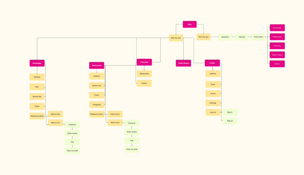
Sitemap

I created intuitive flows to ensure users could efficiently accomplish their key objectives while reducing existing pain points.
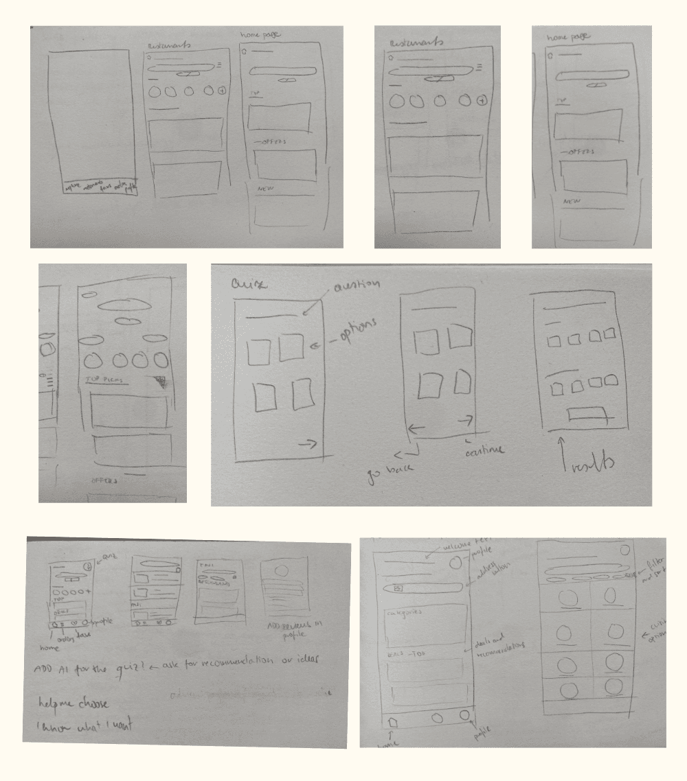
Paper Wireframes

I created paper wireframes to quickly explore layout and user flow options, allowing me to refine ideas and identify potential issues before moving to higher-fidelity designs. This early-stage exploration helped lay a solid foundation for the final design.

Low-Fidelity Wireframes

I developed a low-fidelity mockup to test and validate key user flows and interactions. This allowed me to gather feedback early, make necessary adjustments, and ensure a strong foundation before moving to a higher-fidelity version.

Usability Study

Study Type

Study Type

Study Type

Unmoderated Study

Unmoderated Study

Unmoderated Study

Location

Location

Location

Online

Online

Online

Participants

Participants

Participants

8 Participants

8 Participants

8 Participants

Length

Length

Length

5-10 Minutes

5-10 Minutes

5-10 Minutes

Feedback

Key Insights

Many users struggled to find or recognize key navigation elements (menu, back button, address input, order tracking).

Many users struggled to find or recognize key navigation elements (menu, back button, address input, order tracking).

Many users struggled to find or recognize key navigation elements (menu, back button, address input, order tracking).

Users were unsure what to do on certain screens due to a lack of guidance or text.

Users were unsure what to do on certain screens due to a lack of guidance or text.

Users were unsure what to do on certain screens due to a lack of guidance or text.

Elements like text jumping, inconsistent spacing, and unclear icons made the experience feel unpolished.

Elements like text jumping, inconsistent spacing, and unclear icons made the experience feel unpolished.

Elements like text jumping, inconsistent spacing, and unclear icons made the experience feel unpolished.

Users liked the circular category design but found some elements (like the homepage layout) visually overwhelming.

Users liked the circular category design but found some elements (like the homepage layout) visually overwhelming.

Users liked the circular category design but found some elements (like the homepage layout) visually overwhelming.

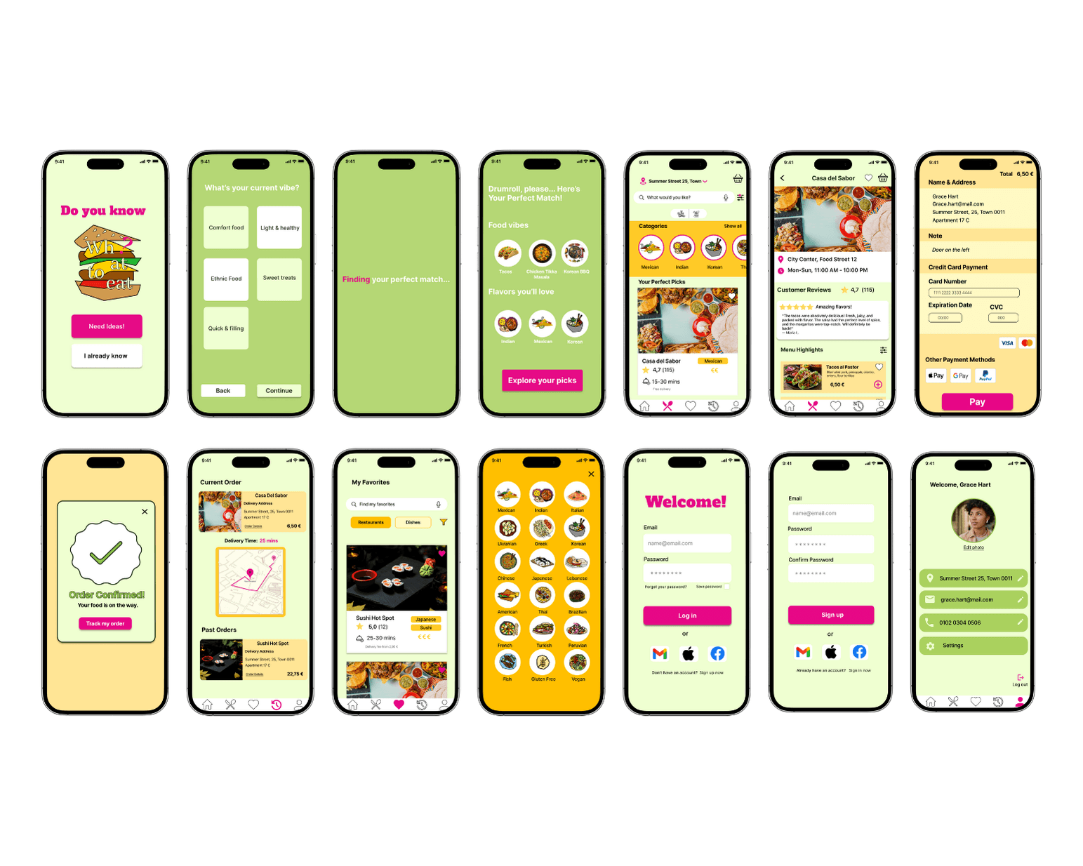
High-Fidelity Mockups

Based on insights from the usability study, I refined the high-fidelity prototype by improving the visibility of key navigation elements, like the menu and back button, and adding clear text prompts for better guidance. I addressed layout issues by fixing inconsistent spacing and unclear icons, while also simplifying the homepage to reduce visual clutter. These changes aimed to create a more intuitive and polished user experience.

This video demonstrates the functionality and user interactions within the app.
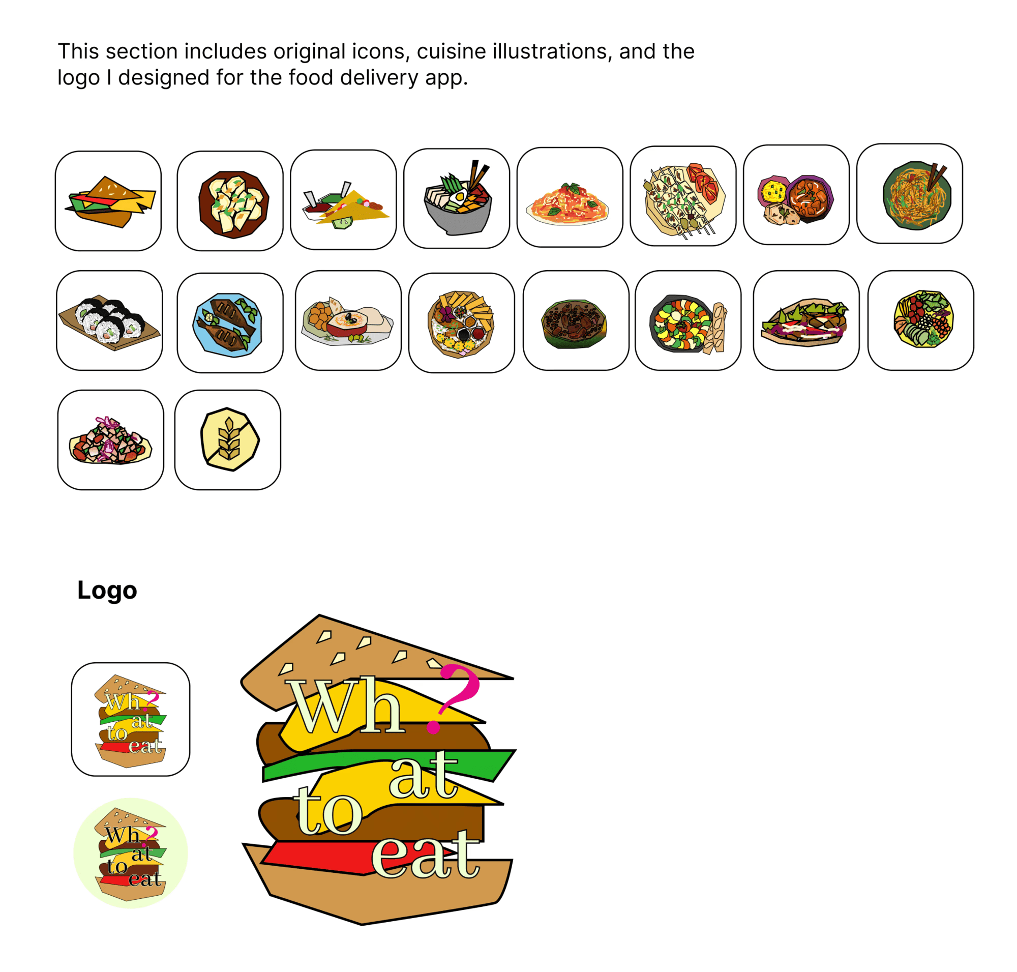
UI Kit

Custom Visual Elements

Color Psychology

The app’s color palette was inspired by mango and pomegranate, fruits I find energizing and playful. I aimed to create a fresh, vibrant experience by carefully selecting colors that evoke excitement and engagement.

Green, the primary color, conveys energy, health, and freshness, reinforcing the app’s connection to natural ingredients.

Yellow adds warmth, optimism, and a welcoming feel, subtly stimulating appetite while maintaining balance.

Bright pink, used mainly for CTA buttons, adds an unexpected, dynamic touch, enhancing engagement.
Together, these colors create a fresh, inviting, and intuitive user experience, blending playfulness with simplicity.

Challenges

One of the biggest challenges was coming up with a unique yet intuitive idea. With so many food delivery apps available, I needed to create something that stood out while keeping it simple and user-friendly. Refining the core concept and prioritizing essential features before focusing on details like colors was a key part of this process. Another challenge was ensuring that the quiz’s purpose was clear—initial testing showed that users didn’t immediately understand its role, which made me rethink how to make it more intuitive. Additionally, navigating conflicting feedback was difficult at times. Some users had opposing opinions, so I had to put myself in their shoes, find patterns in the feedback, and strike a balance between keeping certain elements and making necessary changes.

Lessons Learned

Through this process, I learned that even if a feature feels intuitive to most users, there will always be some who need extra guidance—it’s my job to simplify and clarify the experience as much as possible. I also realized that feedback is one of the most valuable aspects of the design process. It helped me see my design from different perspectives, uncover challenges, and make more informed decisions. In the future, I would conduct usability testing even earlier to identify potential issues sooner. Above all, this project reinforced the importance of listening to users and ensuring that designs are accessible and meaningful for everyone.

Do you like my work? Let’s connect!

Do you like my work? Let’s connect!

Do you like my work? Let’s connect!

© 2025. Made by Katarína Pavlů