solving decision fatigue in food ordering


What To Eat?
What To Eat?
What To Eat?
What To Eat?
Role
Role
Role
Role
UX/ UI Designer
UX/ UI Designer
UX/ UI Designer
UX/ UI Designer
Tools
Tools
Tools
Tools
Figma
Figma
Figma
Figma
Canva
Canva
Canva
Canva
Google Forms
Google Forms
Google Forms
Google Forms
Skills
Skills
Skills
Skills
User Research
User Research
User Research
User Research
Wireframing
Wireframing
Wireframing
Wireframing
Prototyping
Prototyping
Prototyping
Prototyping
Usability Testing
Usability Testing
Usability Testing
Usability Testing
Industry
Industry
Industry
Industry
Food
Food
Food
Food
''Ordering food shouldn’t feel exhausting.''
-participant of the interview
''Ordering food shouldn’t feel exhausting.''
-participant of the interview
''Ordering food shouldn’t feel exhausting.''
-participant of the interview
''Ordering food shouldn’t feel exhausting.''
-participant of the interview
What?
What?
What?
Design a food ordering experience that feels more personal and less overwhelming.
Design a food ordering experience that feels more personal and less overwhelming.
Design a food ordering experience that feels more personal and less overwhelming.
Why?
Why?
Why?
People often experience decision fatigue when faced with too many food choices. This can lead to frustration, indecision, or poor choices, especially when they're hungry or tired.
People often experience decision fatigue when faced with too many food choices. This can lead to frustration, indecision, or poor choices, especially when they're hungry or tired.
How?
How?
How?
By researching user behavior, identifying key pain points, and designing a system that simplifies choices, adds personal touches, and supports faster, smarter decision-making.
By researching user behavior, identifying key pain points, and designing a system that simplifies choices, adds personal touches, and supports faster, smarter decision-making.
Personas
Personas
I developed personas to understand diverse user needs, keeping the design user-centric and inclusive.
I developed personas to understand diverse user needs, keeping the design user-centric and inclusive.
''Between work and parenting I don't have time to waste, ordering food should be quick and stress free.''
-Sarah Mitchel, busy single parent
''Between work and parenting I don't have time to waste, ordering food should be quick and stress free.''
-Sarah Mitchel, busy single parent
Needs
Needs
Family friendly options
Family friendly options
Family friendly options
Guidance in choosing food
Guidance in choosing food
Guidance in choosing food
Reviews for inspo
Reviews for inspo
Reviews for inspo
Save go-to spots
Save go-to spots
Save go-to spots
I spend too much time picking what to eat. I usually end up overthinking my choice.
-Jake Thompson, hesitant foodie
I spend too much time picking what to eat. I usually end up overthinking my choice.
-Jake Thompson, hesitant foodie
Frustrations
Frustrations
Complicated navigation
Complicated navigation
No new discoveries, same meal suggestions
No new discoveries, same meal suggestions
Complicated navigation
No new discoveries, same meal suggestions
Spends too much time ordering
Spends too much time ordering
Spends too much time ordering
Unclear delivery tracking
Unclear delivery tracking
Unclear delivery tracking
I love trying new cuisines
-Priya Patel, travel blogger
I love trying new cuisines
-Priya Patel, travel blogger
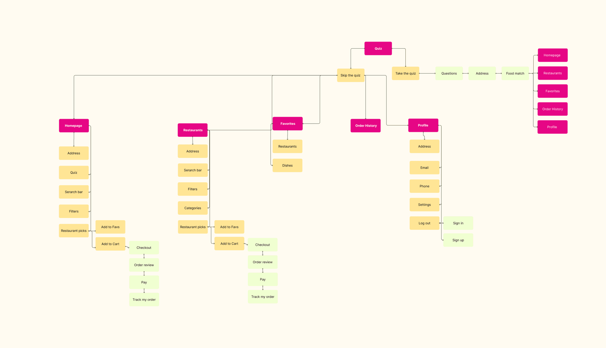
Sitemap
Sitemap
Problem n.1
Problem n.1
What should feel easy (picking what to eat) turns into mental overload.
This is decision fatigue: when the brain gets tired from making too many small choices, leading to frustration or avoidance.
Instead of feeling inspired, users feel stuck. They want help narrowing down options and discovering meals they’ll actually enjoy, without the mental effort.
Solution n.1
Solution n.1
Create a food ordering experience that reduces decision fatigue by offering personalized suggestions, smart filters, and an intuitive way to discover meals without overwhelming the user.
Create a food ordering experience that reduces decision fatigue by offering personalized suggestions, smart filters, and an intuitive way to discover meals without overwhelming the user.
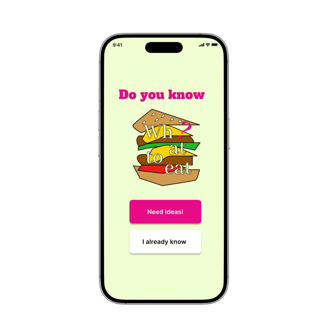
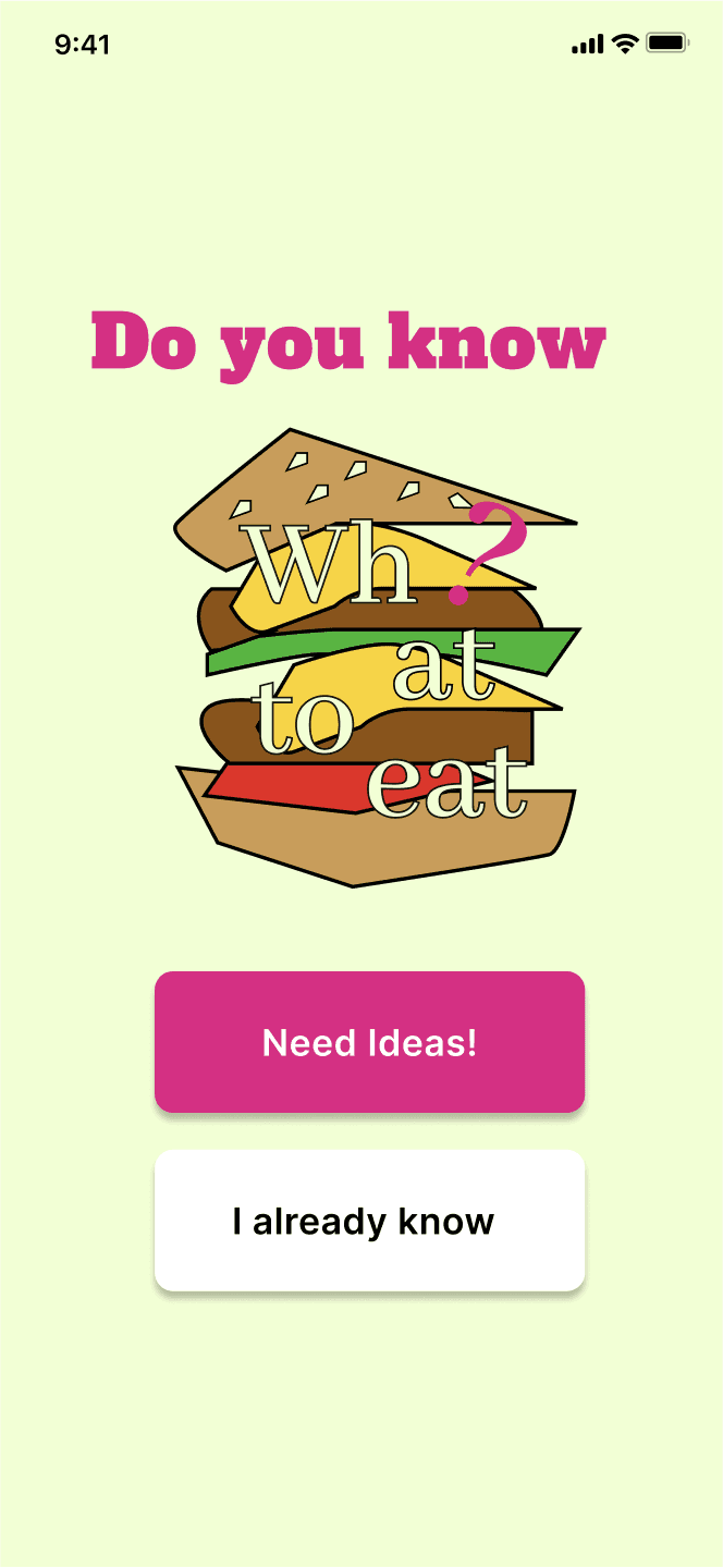
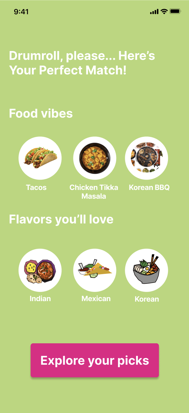
The Quiz
The Quiz
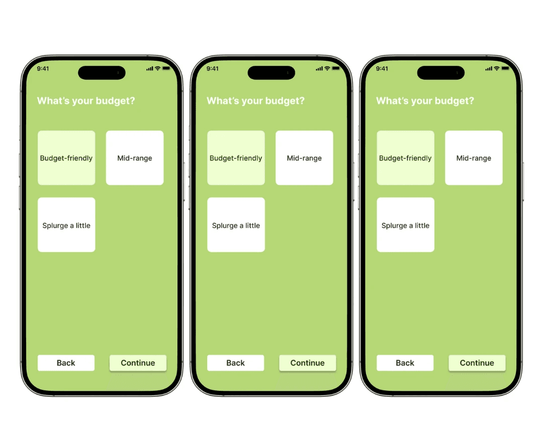
To reduce decision fatigue, I designed a short, optional quiz to guide users toward meals that fit their mood and needs.
To reduce decision fatigue, I designed a short, optional quiz to guide users toward meals that fit their mood and needs.

It asks simple, focused questions. The quiz is quick, skippable, and fun. Users can skip any question or jump straight to browsing if they already know what they want.
It asks simple, focused questions. The quiz is quick, skippable, and fun. Users can skip any question or jump straight to browsing if they already know what they want.
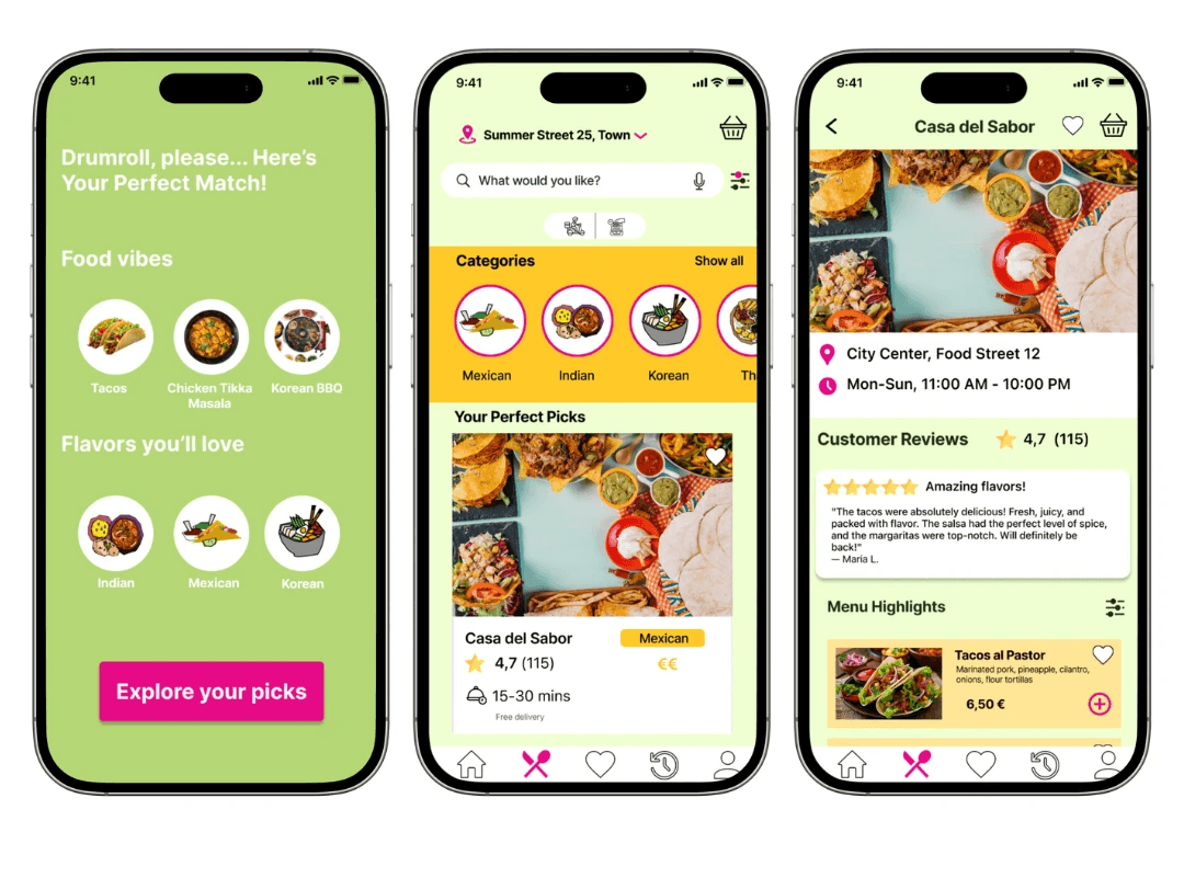
After the quiz, they’re shown a list of suggested cuisines or meals that match their preferences—making the process faster, easier, and more personal.
After the quiz, they’re shown a list of suggested cuisines or meals that match their preferences—making the process faster, easier, and more personal.
Problem n.2
Problem n.2
When juggling work, kids, and daily responsibilities, food decisions need to be quick and easy. These users want to save their favorite meals, filter for family-friendly options, and avoid last-minute decision chaos.
When juggling work, kids, and daily responsibilities, food decisions need to be quick and easy. These users want to save their favorite meals, filter for family-friendly options, and avoid last-minute decision chaos.
Solution n.2
Solution n.2
Design a food ordering experience that helps busy parents quickly find family-friendly meals, save favorites, and reduce daily decision stress
Design a food ordering experience that helps busy parents quickly find family-friendly meals, save favorites, and reduce daily decision stress
The Quiz
The Quiz
The quiz I designed, also considers who you're ordering for, whether it's just you, your partner, or the whole family. This helps tailor suggestions that fit everyone's needs, like showing only restaurants with kids' menus or family-friendly options.
It’s a small step that makes a big difference for busy users who don’t have time to scroll through endless menus.
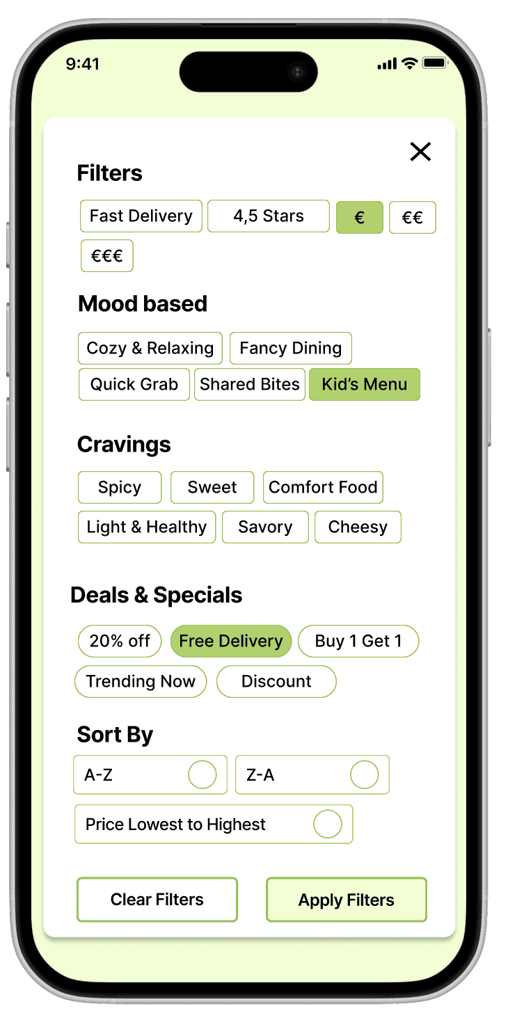
Filter
Filter
Users can filter restaurants based on specific needs, like finding places with a kids’ menu or choosing from a variety of cuisines. This helps families and groups quickly narrow down options that suit everyone.
Users can filter restaurants based on specific needs, like finding places with a kids’ menu or choosing from a variety of cuisines. This helps families and groups quickly narrow down options that suit everyone.

Favorites
Favorites
Users can save favorite restaurants or specific dishes to easily re-order later. This feature is especially helpful for busy users who already know what works for them.
Users can save favorite restaurants or specific dishes to easily re-order later. This feature is especially helpful for busy users who already know what works for them.
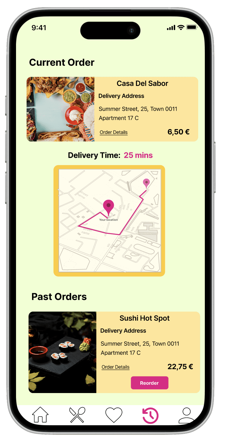
Order tracker and past orders
Order tracker and past orders
A clear history page allows users to track past orders and repeat them with a single click. It saves time and removes the hassle of searching all over again.
Problem n.3
Problem n.3
Users are curious and open to discovering new cuisines, but apps often don’t support this well. There’s a lack of inspiration, limited recommendations, and no easy way to explore unfamiliar options.
They also want to see what others enjoyed -reviews, ratings, and popular picks - to help guide their choice and make exploration more exciting.
Solution n.3
Solution n.3
Make food discovery easy and exciting by offering curated suggestions, diverse cuisine categories, and reviews from other users to help inspire confident, new choices.
Make food discovery easy and exciting by offering curated suggestions, diverse cuisine categories, and reviews from other users to help inspire confident, new choices.

The Quiz
The Quiz
The quiz supports discovery by suggesting new cuisines the user might not have tried before—based on their preferences and mood.
Users can also browse a list of all cuisine types, making it easy to explore something different at any time.
The quiz supports discovery by suggesting new cuisines the user might not have tried before—based on their preferences and mood.
Users can also browse a list of all cuisine types, making it easy to explore something different at any time.
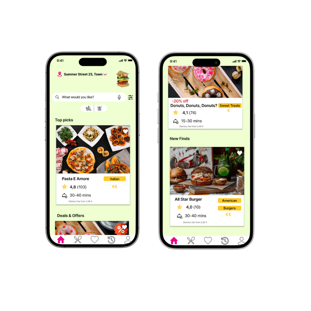
The Homepage
The Homepage
On the homepage, there are recommended picks and new restaurant highlights to spark curiosity and provide fresh options.
On the homepage, there are recommended picks and new restaurant highlights to spark curiosity and provide fresh options.
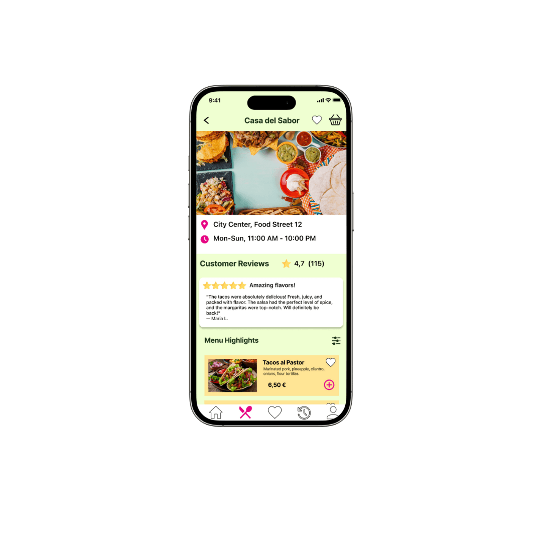
Reviews
Reviews
There’s also a review section, where users can read about others’ experiences. This social input helps them feel more confident when trying something unfamiliar.
There’s also a review section, where users can read about others’ experiences. This social input helps them feel more confident when trying something unfamiliar.
*behind the screens
*behind the screens

I developed a low-fidelity mockup to test and validate key user flows and interactions. This allowed me to gather feedback early, make necessary adjustments, and ensure a strong foundation before moving to a higher-fidelity version.
I developed a low-fidelity mockup to test and validate key user flows and interactions. This allowed me to gather feedback early, make necessary adjustments, and ensure a strong foundation before moving to a higher-fidelity version.
I developed a low-fidelity mockup to test and validate key user flows and interactions. This allowed me to gather feedback early, make necessary adjustments, and ensure a strong foundation before moving to a higher-fidelity version.
Usability Study
Usability Study
Unmoderated Study
Unmoderated Study
Unmoderated Study
Online
Online
Online
8 participants
8 participants
8 participants
5-10 minutes
5-10 minutes
5-10 minutes
Feedback
Feedback
Difficulties
Difficulties
Navigation Confusion
Navigation Confusion
Lack of guidance
Lack of guidance
Order confirmation confusion
Order confirmation confusion
Unclear navigation bar
Unclear navigation bar
4/8 Adress input unclear
4/8 Adress input unclear
3/8 Quiz purpose unclear
3/8 Quiz purpose unclear
Intuitive
Intuitive
5/8 found the quiz easy to use
5/8 found the quiz easy to use
6/8 found the tracking delivery option intuitive
6/8 found the tracking delivery option intuitive
6/8 found the choosing the restaurant process straightforward
6/8 found the choosing the restaurant process straightforward
4/8 found the cuisine selection intuitive
4/8 found the cuisine selection intuitive
*all the other high fidelity screens
*all the other high fidelity screens
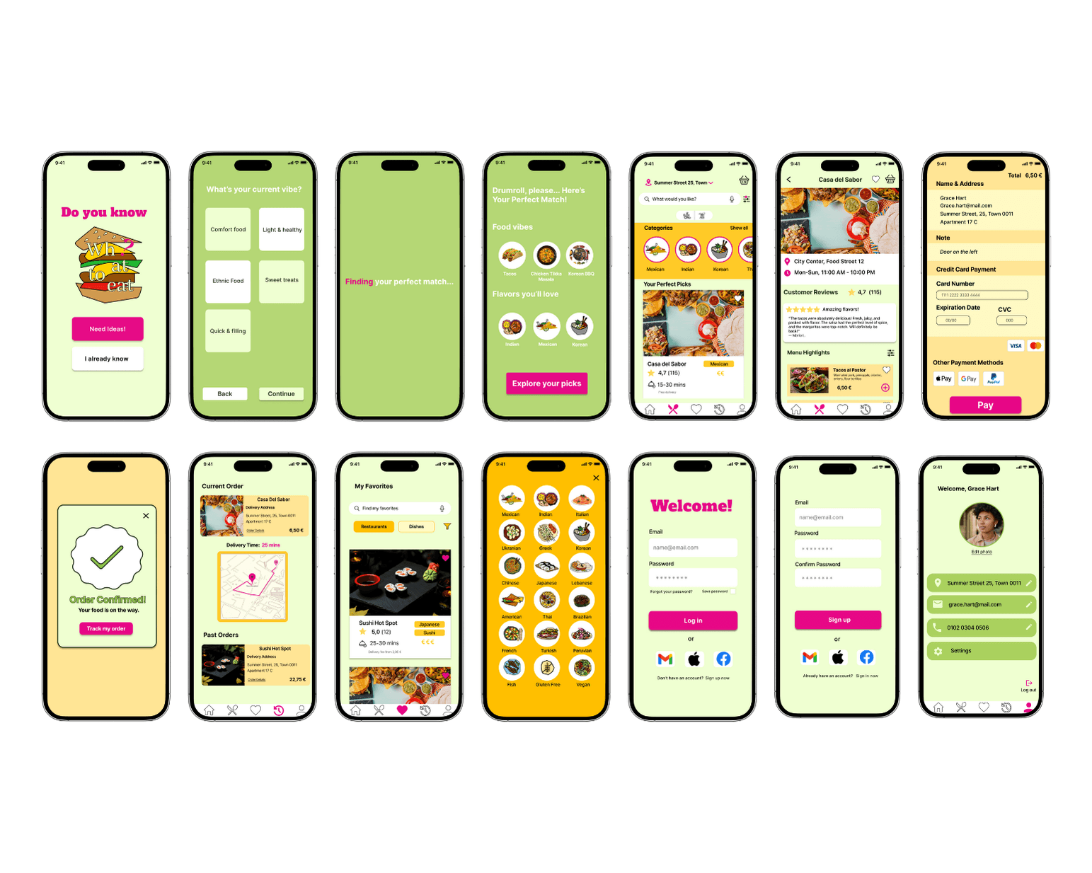
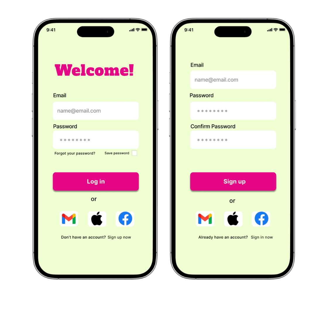
log-in and sign-up
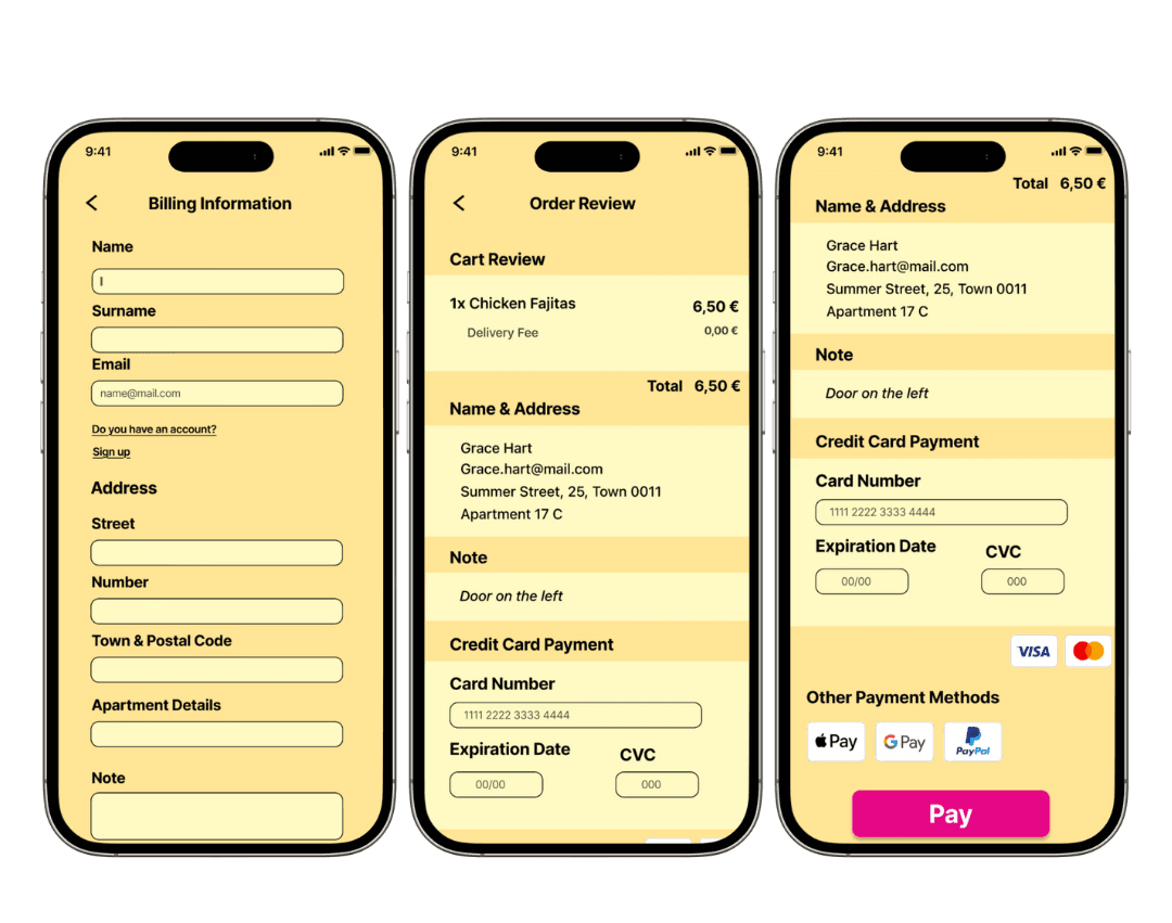
payment

ordering and tracking the order
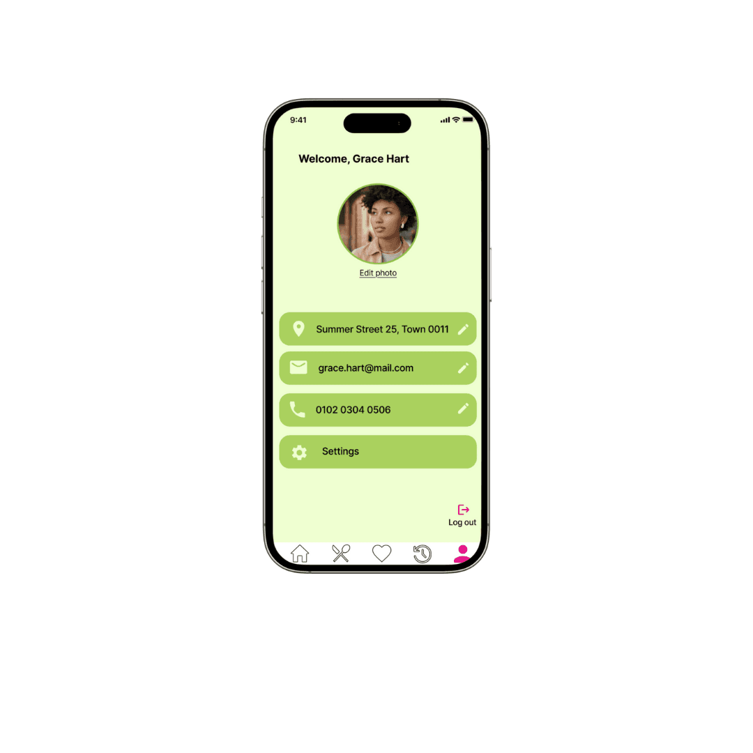
profile
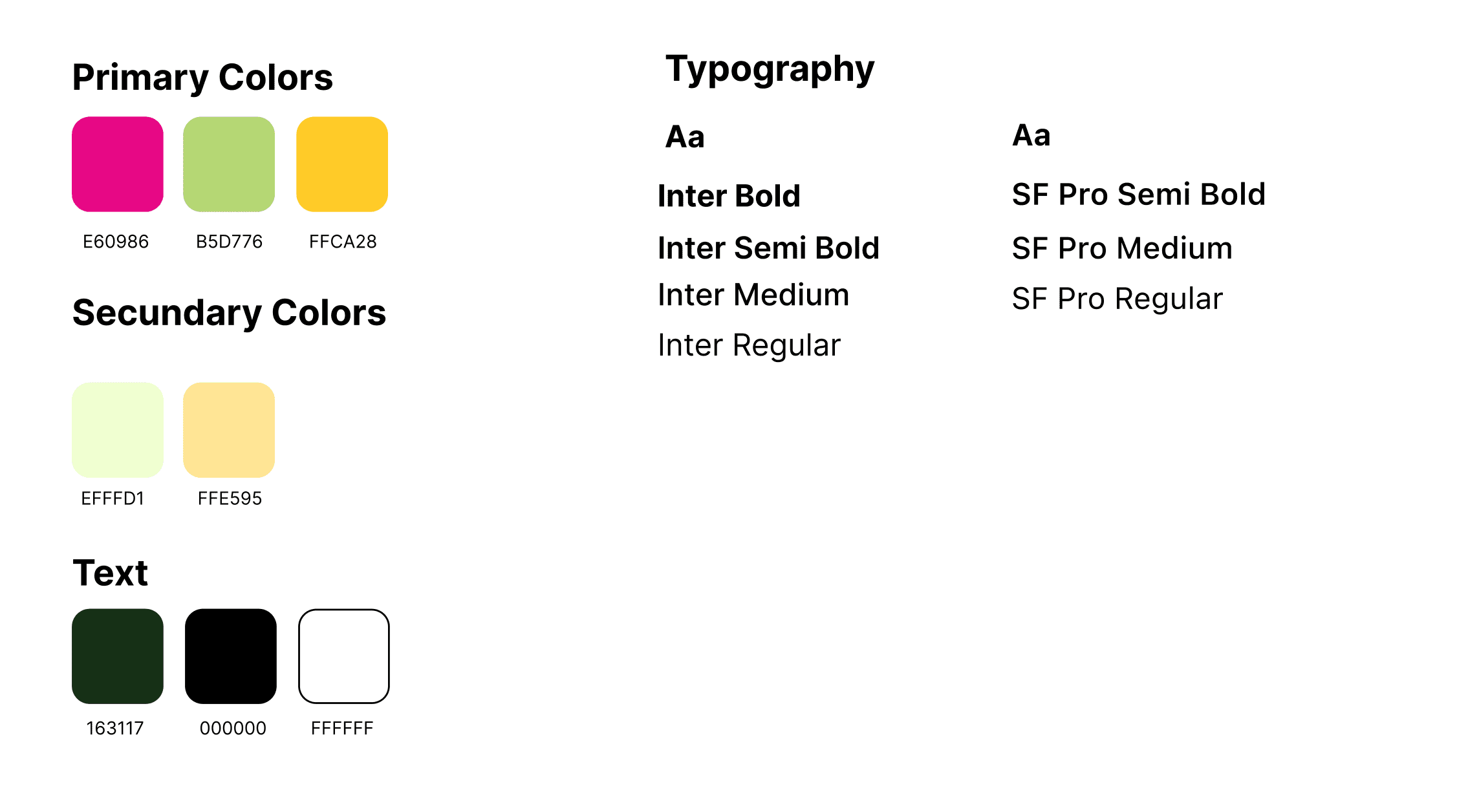
Ui Kit
Business Impact
Business Impact
Higher user retention
Higher user retention
*By making the app more personal and easy to use (through the quiz and favorites), users are more likely to come back regularly.
*By making the app more personal and easy to use (through the quiz and favorites), users are more likely to come back regularly.
Increased average order value
Increased average order value
*Smart recommendations and favorites encourage users to explore new dishes or add extras.
*Smart recommendations and favorites encourage users to explore new dishes or add extras.
Boost in discovery engagement
Boost in discovery engagement
*Highlighting new restaurants and adding reviews drives visibility for more partners.
*Highlighting new restaurants and adding reviews drives visibility for more partners.
Time-saving for busy users
Time-saving for busy users
*More orders during peak hours (e.g., from families or professionals who want quick decisions).
*More orders during peak hours (e.g., from families or professionals who want quick decisions).
More satisfied users
More satisfied users
*Better reviews, more word-of-mouth growth.
*Better reviews, more word-of-mouth growth.
Challenges
Challenges
Standing Out in a Crowded Market
Standing Out in a Crowded Market
Designing a food app in a competitive space meant I had to make it both unique and intuitive. I came up with the idea of a smart quiz, along with features like saved favorites, personalized filters, and quick reordering, to help the app stand out while keeping the experience simple.
Designing a food app in a competitive space meant I had to make it both unique and intuitive. I came up with the idea of a smart quiz, along with features like saved favorites, personalized filters, and quick reordering, to help the app stand out while keeping the experience simple.
Designing a food app in a competitive space meant I had to make it both unique and intuitive. I came up with the idea of a smart quiz, along with features like saved favorites, personalized filters, and quick reordering, to help the app stand out while keeping the experience simple.
Designing a food app in a competitive space meant I had to make it both unique and intuitive. I came up with the idea of a smart quiz, along with features like saved favorites, personalized filters, and quick reordering, to help the app stand out while keeping the experience simple.
Early testing showed users didn’t fully understand the purpose of the quiz. I refined the flow, simplified the language, and made it feel more like a fun, helpful tool rather than a task—ensuring it clearly supported decision-making without adding friction.
Early testing showed users didn’t fully understand the purpose of the quiz. I refined the flow, simplified the language, and made it feel more like a fun, helpful tool rather than a task—ensuring it clearly supported decision-making without adding friction.
Clarifying the Quiz Experience
Clarifying the Quiz Experience
Balancing Personalization with Simplicity
Balancing Personalization with Simplicity
I wanted the app to feel personal and smart, but not overwhelming. I carefully designed filters, recommendations, and discovery features to support quick decisions—without cluttering the interface or confusing the user.
I wanted the app to feel personal and smart, but not overwhelming. I carefully designed filters, recommendations, and discovery features to support quick decisions—without cluttering the interface or confusing the user.
Some users wanted more discovery, while others preferred familiar, family-friendly options. I learned to spot patterns in feedback, step into users’ shoes, and make thoughtful decisions that balanced diverse needs.
Some users wanted more discovery, while others preferred familiar, family-friendly options. I learned to spot patterns in feedback, step into users’ shoes, and make thoughtful decisions that balanced diverse needs.
Navigating Conflicting Feedback
Navigating Conflicting Feedback
Lessons Learned
Lessons Learned
Simplify What Feels “Obvious”
Simplify What Feels “Obvious”
Simplify What Feels “Obvious”
Even if a feature feels intuitive, some users will still need guidance. This taught me to always look for ways to clarify and simplify the experience.
Even if a feature feels intuitive, some users will still need guidance. This taught me to always look for ways to clarify and simplify the experience.
Even if a feature feels intuitive, some users will still need guidance. This taught me to always look for ways to clarify and simplify the experience.

Feedback is Gold
Feedback is Gold
Feedback is Gold
User feedback gave me new perspectives, revealed hidden challenges, and helped me improve the design. I learned to embrace it early and often.
User feedback gave me new perspectives, revealed hidden challenges, and helped me improve the design. I learned to embrace it early and often.
User feedback gave me new perspectives, revealed hidden challenges, and helped me improve the design. I learned to embrace it early and often.

Test Earlier, Learn Faster
Test Earlier, Learn Faster
Test Earlier, Learn Faster
If I were to start over, I’d conduct usability testing earlier to catch issues sooner and refine the flow from the beginning.
If I were to start over, I’d conduct usability testing earlier to catch issues sooner and refine the flow from the beginning.
If I were to start over, I’d conduct usability testing earlier to catch issues sooner and refine the flow from the beginning.

Design for Everyone
Design for Everyone
Design for Everyone
This project reminded me that the best design is inclusive. It’s not just about what works—it’s about making sure it works for everyone.
This project reminded me that the best design is inclusive. It’s not just about what works—it’s about making sure it works for everyone.
This project reminded me that the best design is inclusive. It’s not just about what works—it’s about making sure it works for everyone.

Do you like my work? Let’s connect!
Do you like my work? Let’s connect!
Do you like my work? Let’s connect!